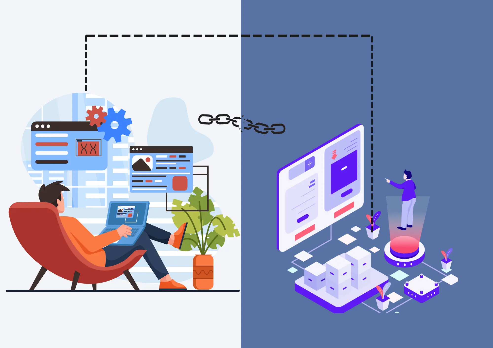
Every business, entrepreneur, and startup knows that the first step in establishing a professional online presence is having a great website. However, if you want to generate more leads, sales, and referrals, you’ll need a killer website landing page.
Which begs the question:
What Is a Website Landing Page?
A landing page is a webpage you design to persuade users to take one specific action. The actions can be to:
- Buy your products or services
- Sign up for your mailing list
- Download a white paper
- Download your app
Whatever the action, landing pages only have one CTA (Call-to-Action).
A Landing Page In Detail
Content
In terms of content, a landing page has one simple message: to persuade visitors to take action. The content of a landing page only explains the benefit of a user taking the action you want.
The Design
A landing page design complements the content to drive the desired action. As a result, the design is clutter-free and simple to:
- Allow a seamless browsing experience
- Prevent competition with the viewers’ attention
However, the design should sync with your brand identity.
Goal
The end goal of a landing page is to make your visitors click a button. Both your content and design should drive to your end goal. All your buttons should have a clear microcopy that stands out against the page’s background.
The Anatomy
The anatomy of a landing page is a single page. You can divide it into separate sections, but you should stick to just one page that isn’t too long.
Headers, Subheaders, Buttons, and Images
Headings, subheadings, buttons, and images of landing pages should represent your page’s message in a powerful and effective way while ensuring all the elements remain cohesive.
Landing Page Template
Unless you plan on designing your landing page from scratch, ensure you use a template. A template helps with the landing page visuals and establishes a strong visual hierarchy to guide visitors to the action you want them to take.
Like homepages, your landing pages are often visitors’ first experience on your website. However, a website landing page serves a different purpose from a homepage.
Landing Page vs. Home Page
A home page contains general information about your company. It’s a gateway to other pages on your site where visitors can learn more.
On the flip side, landing pages are standalone pages that aim to drive conversions. A landing page allows you to turn visitors into leads and customers.
Besides, a homepage may have multiple (CTAs). You might encourage visitors to browse your site’s blog, check out your products, and simultaneously sign up for your newsletter.
In contrast, landing pages only have one CTA that drives a specific action. That might be:
- Filling out a form
- Downloading a resource
- Purchasing your product or service
Any other CTAs in a landing page are usually duplicates or close variations of the primary CTA.
Types of Landing Pages
You can create two main types of landing pages:
- Lead generation landing pages
- Click-through landing pages
Lead Generation Landing Pages
Businesses create lead generation landing pages to capture visitor information like email address, name, or phone number in exchange for a free offer or resource such as:
- An ebook
- White paper
- Webinar
Lead generation landing pages typically feature a lead form and a clear and compelling headline explaining the offer’s benefit.
Here is an example of a lead generation landing page.
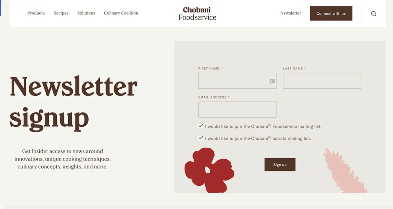
What’s Working: Chobani Foodservice leads with a straightforward headline immediately telling users what to do. Below the headline, Chobani explains what users will get after signing up for their newsletter.
Another good example of a lead generation landing page is that of Backlinko.
What’s working: The company starts the landing page with a strong headline that persuades users to sign up for exclusive SEO strategies. Users who land on this page get a clear picture of what they’ll get by subscribing to Backlinko’s email list.
Click-Through Landing Pages
A click-through landing page aims at persuading the users to click through to a specific page and drive a specific action there, such as:
- Signing up for a free trial
- Making a purchase
A click-through landing page has a clear and compelling headline, persuasive copy, and a clear CTA button, like on the SoFi Bank page.
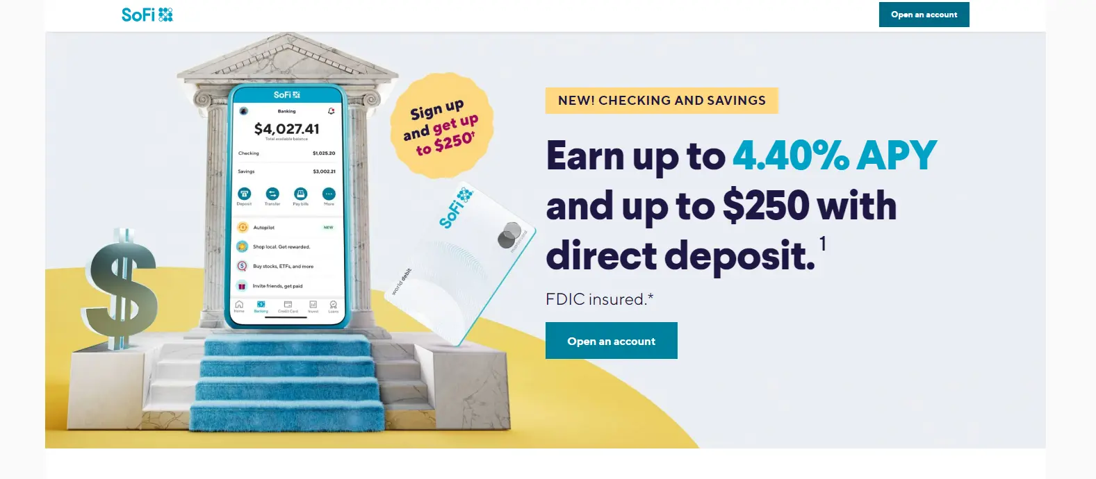
What Works: The headline is straightforward and includes numbers that grab visitors’ attention. Before the CTA, SoFi highlights what visitors will get from the free trial.
Another excellent click-through landing page example is from Adobe.
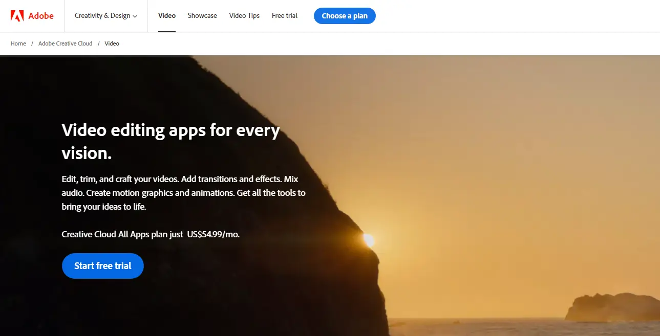
What Works: The landing page title conveys a clear benefit to users who land on this page. The page also has a video sample that gives users a peek into how the software operates without driving the visitor out of that page.
Why Are Landing Pages Important
A website landing page boosts the efficacy of your digital marketing campaigns.
While many businesses solely rely on their home pages for marketing campaigns, they aren’t as effective as landing pages. Your homepage cannot generate as many leads and conversions as a dedicated landing page. With landing pages, you can:
- Match visitors’ expectations and needs through focused and targeted messaging
- Track and analyze the performance of your marketing campaign
- Experiment with headlines, subheadings, and CTAs without affecting your main website.
In other words, you can offer a highly focused and optimized experience to your visitors with a landing page. That way, you’ll increase the likelihood of conversions and improve the results of marketing campaigns.
How Do Landing Pages Work?
The landing page is the last step before converting your visitors (after which they become customers or leads). Your business can use landing pages to:
- Register users for an event
- Get email newsletter signups
- Sell a product or drive pre-orders for it
- Persuade people to download your app
- Distribute marketing material like catalogs and ebooks
- Schedule users for a product demonstration or sales call
A website landing page isn’t excellent for:
- Telling your company story
- Presenting several different products
- Linking to other pages on your website
People usually land on your landing page after a marketing strategy. For instance, after:
- Clicking on your ad on social media
- Clicking on your ad on Google’s search
- Reading a product description in your blog post
However, here’s a follow-up question:
How Do You Create a Powerful Landing Page that Converts?
While there are a gazillion ways to create a landing page, you only have to remember one thing:
The page will revolve around a single action.
If a user comes to your landing page and is distracted by several actions, they might not complete that action. Keep your landing page as simple as you can.
For instance, you can eliminate the top navigation menu for your landing page because a visitor to your landing page is close to purchase. You might lose out on the sale if you distract them and lead them to your latest blog post.
Here is a step-by-step procedure to create a landing page that converts:
Step 1: Define Your Goal
Identify the action you want users to take on your landing page and stick to it throughout the page.
Step 2: Create a Visual Hierarchy
Decide which visual elements are the most important such as buttons, and make them stand out.
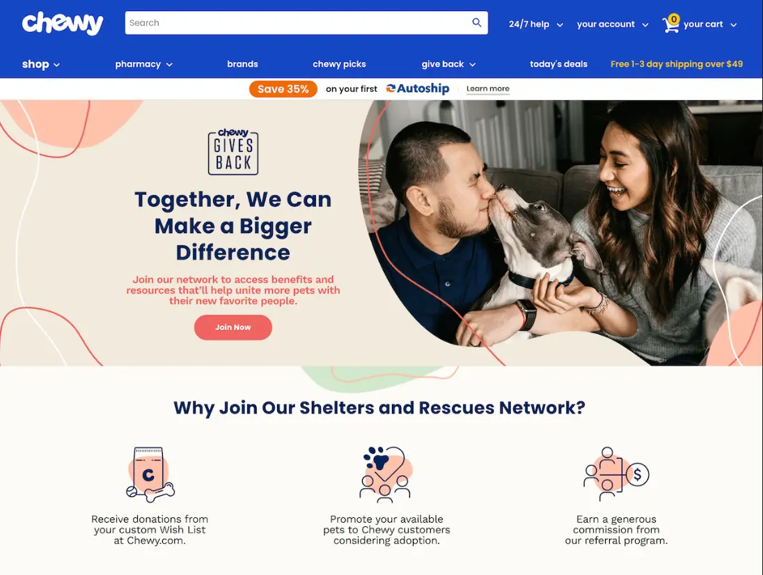
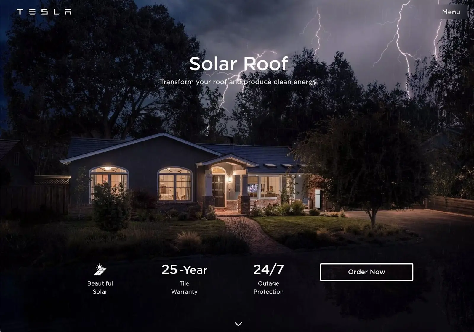
Step 3: Utilize images.
Set the tone and charm your visitors with impactful visuals. Images make your landing page more visually appealing and can illustrate what your landing page is all about, like this one from Chewy.
Or this one from Tesla.
To get a picture for your landing pages, check out the free stock image library such as Pexels, Pixabay, and Unsplash.
Some of the best practices when using images for your landing include:
- Pick a simple and uncluttered image
- Ensure your image complements the design and style of your landing page
- Use images that help users understand the value of your product or services
- Only use high-quality images
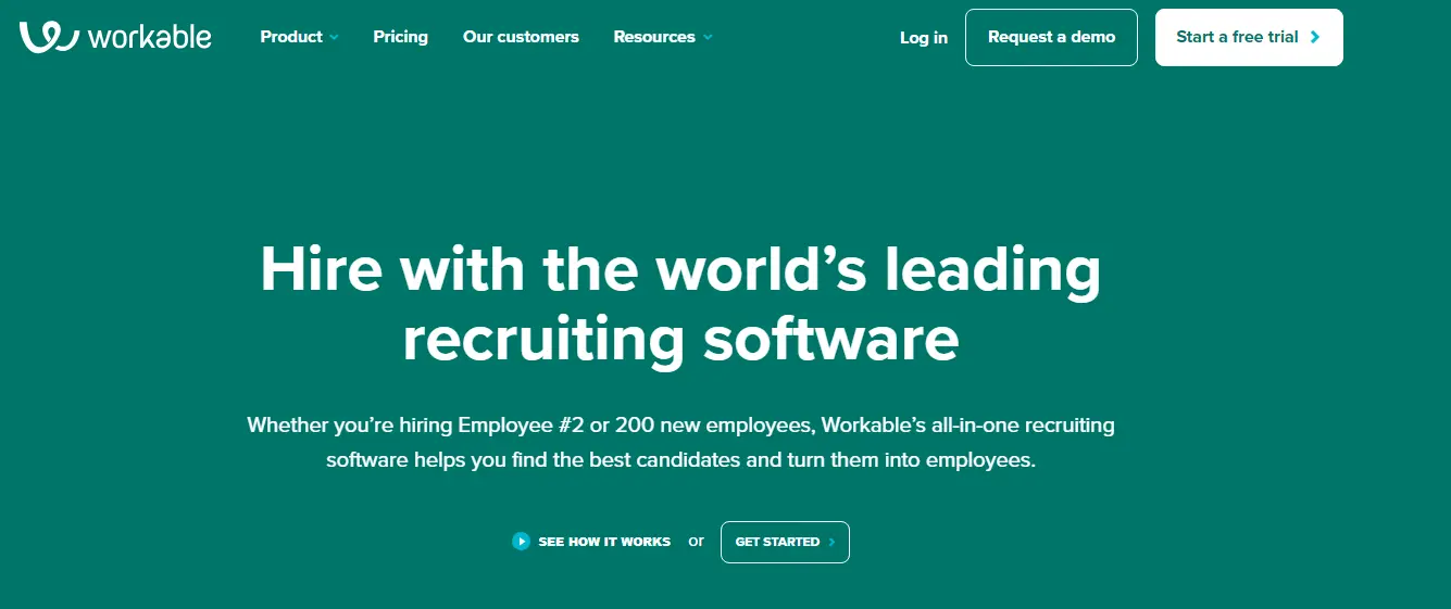
Step 4: Create irresistible Headlines and Subheads
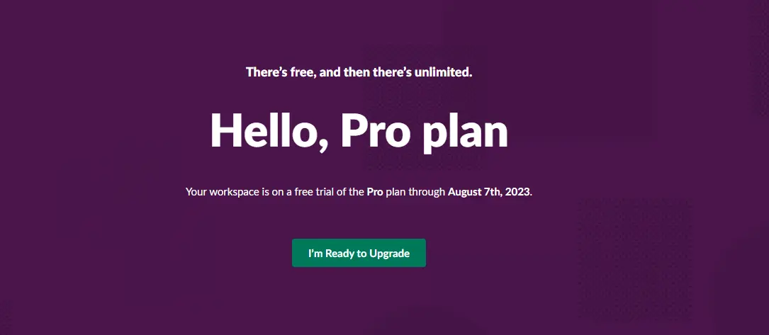
A compelling headline engages the visitor and helps them understand your offer. You can make your value proposition your headline like this one:
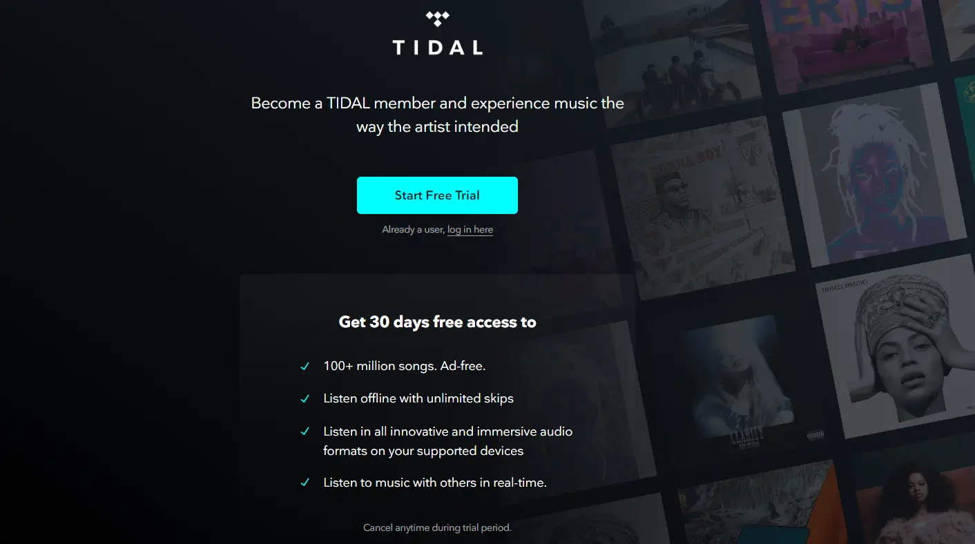
Alternatively, your header can describe what your visitors can expect when they act as you want them. Check this discount offer from Tidal.
Some landing pages’ headlines are followed by subheadings. When that’s the case, write the subhead in a smaller font than the headline, providing more details and an additional nudge to let people convert.
The best example of a landing page header followed by a subheading is from Showtime. The headline says, “Paramount+ is The New Streaming Home of ShowTime.”
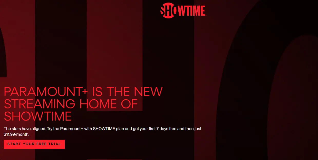
Below the header, the subhead explains details about the pricing and the free trial period.
The best general formula for such a landing page is:
Headline: [Main benefit users will get, in about ten words or fewer ten or free words]
Subhead: [Additional benefits in under 20 words]
Other tips for creating better landing page headlines include:
- Address users’ pain points + desires using.
- Use power words such as (boost, upgrade, unlock, transform, etc.) to trigger action.
- Leverage statistics or numbers whenever possible to emphasize the value of your product or service
Step 5: Write A Killer Copy
After writing captivating headers that give your visitors a reason to read on, create a copy to describe your offer in detail. The copy is usually a few sentences long.
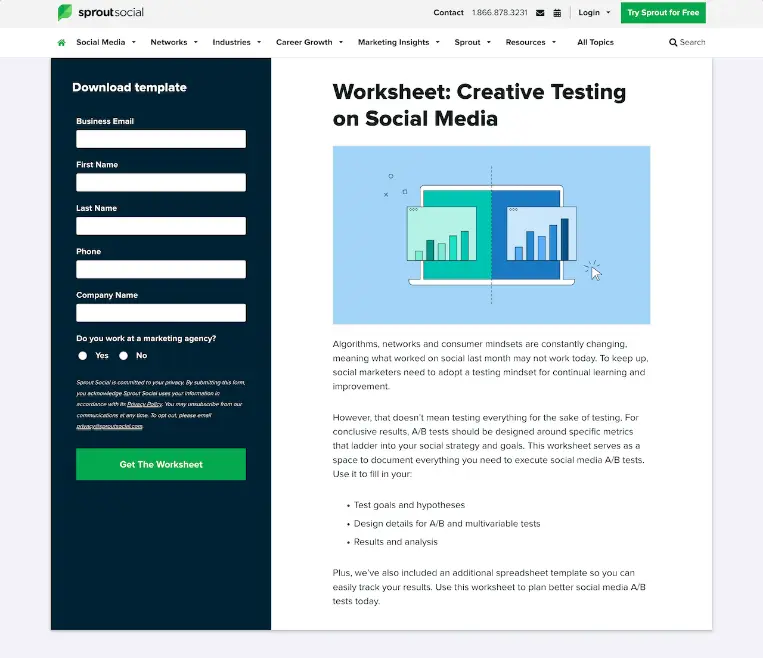
Check the Sproutsocial landing page below for a landing page copy example.
You can also include testimonials from satisfied customers or clients to convince people to act. However, keep your landing page brief.
Step 6: Add a Form for Lead Generation Landing pages
If you plan to generate leads from your marketing campaign, include a form for the users to enter their information.
Otherwise, you’ll not get the lead.
In the forms, you can ask for as much information as you want. However, a HubSpot study shows that the more field you include, the fewer people will fill them out.
To maximize conversion, you should only request the email address.
However, some businesses require extra information, like the user’s name, phone number, location, or more, to sell to visitors later.
Step 7: Trigger Action with a strong CTA (Call to action)
Make it clear to your Landing page visitors what they should do with a strong CTA. Your CTA can ask users to:
- Install your app
- Download an ebook
- Sign up for an event
- Buy a product or service
- Subscribe to your business newsletter
Your CTA should display prominently. You can include it immediately after the headline or subhead, like this one from Apple Music.

If your landing page has a form, your CTA will come after the form like this:
The information in the button should state what the user will get after clicking it.
Step 8: Highlight The Value of Your Offer
Let users know how clicking on the CTA or signing up will benefit them. Explain what they will get out of what you offer.
Step 9: Go for The Hard Sell
Many businesses are afraid to be direct with their offer. However, you’re creating your landing page for a reason, and you should go for it. Be bold with your unique selling proposition.
Landing Page Examples
Let’s explore how some landing page examples utilize the page elements we conveyed above to maximize conversions.
1. Wistia
Wistia is a video-hosting platform like YouTube but for businesses. Their landing page is an excellent example.
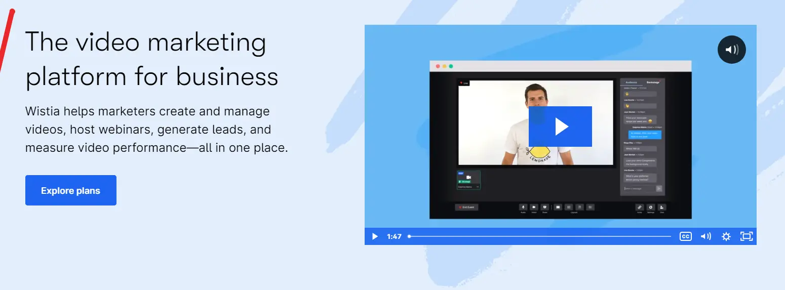
The headline goes straight into the action, stating what users will get. Plus, the video showcases what users can create on that platform.
If a user has any doubt about the platform, they can scroll down to read testimonials from among the 374,000 happy customers.
Why is Wistia’s landing page impressive?
- Simplicity: The form of the landing page is easy to fill out,
- Excellent use of visuals: As a video host, Wistia showcases its features using various mediums such as videos, colorful graphics, and marketing-focused cartoons.
2. Talkspace

The company is an online therapy service that capitalizes on trustworthiness with the above landing page. The text on the copy tells users that they’ll get a licensed therapist who offers secure and confidential service.
Using shapes on the landing page is a smart idea. Nealy, all landing pages have square boxes, and putting the CTA inside a large circle immediately draws the user’s attention.
Why is Talkspace’s landing page impressive?
- The headline immediately seeks to build trust. Guaranteeing customer security works in their favor, especially by stating they’re HIPPA complainants.
- Great user interface. The uncluttered user interphase is an excellent starting point for mental health resources.
3. Zillow

Zillow’s landing page starts with a simple form asking for a user’s home address. While the home address alone isn’t enough to get a true appraisal value, it will tell about the home’s neighborhood.
If users want to learn more about their property, Zillow prompts them to sign up to continue.
Why is Zillow’s landing page impressive?
- Filling out the form on the landing page is fun. Once you make any marketing process fun, you win, as users won’t see the difficulty.
4. Slack
Slack has a reputation for creating some of the best landing pages. The company is always optimizing for conversion, which is the best way to create a winning landing page.
What makes the above landing page stand out is its content. Slack doesn’t want its users to think that the software is just a messaging app, and its landing page tries to convey that message.
Why is Slack’s landing page impressive?
- Elimination of the navigation bar. The company only includes the most important element in the navigation bar to only allow current customers to log in and potential customers to talk to sales.
- Offers a discount: Money off is a huge sell for new users and an important factor in convincing users to convert.
5. Uber
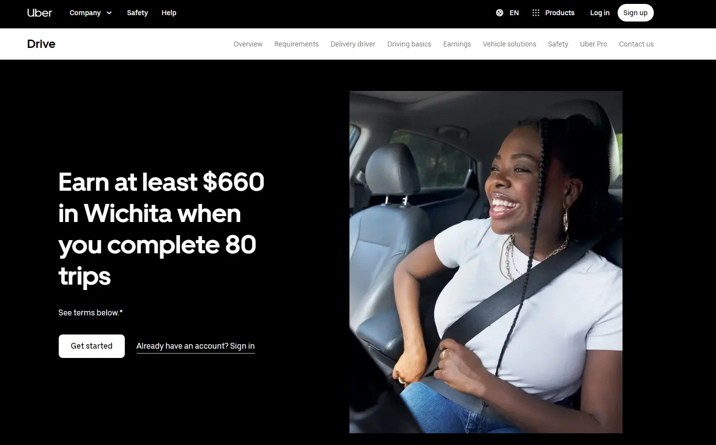
Uber’s website and landing page are a driving force of their current growth. The company focuses on attracting new drivers who want control of their lives.
Its landing page above has an attention-grabbing headline that is irresistible to prospect drivers. If you check their CTA at the button, it implies that a driver that lands on that page is 100% sure they’ll get a position.
Why is Lyft’s landing page impressive?
- The image communicates. Uber might be looking to attract female drivers, which is exactly why they chose the feature image on the landing page.
- Customized data request: Nearly all landing pages ask for an email. However, since Uber is an app, it asks for users’ phone numbers instead.
Drive Action With Your Website Landing Page
Landing pages are critical for converting leads into customers. A website landing page will guide users through the customer journey as they persuade visitors to take action.
The only problem?
Creating a high-converting landing page is a lot of work. If you have read this far but are still confused about:
- How many landing pages should you have
- What should you feature on your landing page
- Which tone is right for you
We can help you create an irresistible landing page that converts leads into customers.